Down and Dirty
A Trip to the New-Build Nitty Gritty
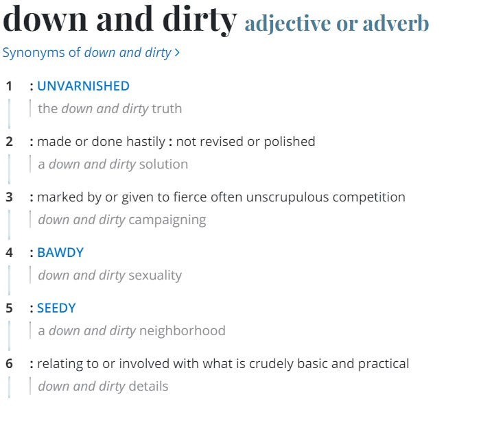
I love studying and playing with words and language and at the same time most of my stress comes when I am unable to use them productively or am misunderstood or find I must explain and explain again what I’m saying because somehow my use of them fails to deliver the intended meaning which is pretty much every five minutes. As you can see from the multiple definitions Merriam Webster gives us for “down and dirty” confusion will abound. How can one phrase mean almost the opposite thing? “Context, grasshopper, context.”
In case you missed it, last Saturday in a live Twitter space I “debated” another housing analyst who lives and dies by and screams and screams the inventory shortage narrative. Before you get too excited, it was not all that exciting. I think we have lost the art of debate. I came armed (with the gracious help of my friends) with notecards, graphs (even) and talking points. I barely needed any of them. Don’t get me wrong, I was very grateful that the moderator kept things civil as the Twitter battle that waged prior to the debate was no fun at all. I hate, hate when people get down and dirty in the definition-#3 sense above. I simply don’t understand it. It’s just not who I am. Can I go there - absolutely, but it is so anti my core that trip down is what I feared most of all prior to Saturday. So it made me wonder how do we start having real debates again where we can talk to one another, share counterpoints and learn?
I think the only way that happens is if we define terms. Banal and boring, you may say, but honestly I see so much “hiding” behind abstract concepts across FinTwit and in the financial media. I don’t like being misunderstood, but I think some people bank on people misunderstanding them and live in the inexactitude of that space. Now, don’t get me wrong, I am a big fan of the ellipsis, for example, because I like the creativity that is implied with it…what are the multiple ways that sentence or thought could end, etc. But that is creative me, sometimes coward me…the productive side of me knows there is a time when we have to agree on meaning or we will be forever frustrated, blocked or lost.
As such I tried to start the conversation by making a distinction that I think many do not make of what we mean when we say housing inventory. The Fed captures only listings for sale that make their way to Realtor.com for example in a graph that contains a title meant to be heuristic (or dictatorial) called: Housing Inventory: Active Listing Count in the United States.
I don’t know about you, but that was a shocking realization for me. I imagined there was a little more science to it if you know what I mean. In this day and age, the mad geniuses at social media companies can probably tell us more about ourselves than we even know and can certainly track our movements. As such, how can we not have a more scientific way of tracking housing inventory and by extension housing inventory for sale? Short answer - it’s a very complicated, messy and emotional process. Emotional, you say? Emotional. I’ve been in this business for a while and I can tell you that people get very emotional about housing as it’s wrapped up in a basic need for shelter and in our shame about what we do and don’t have.
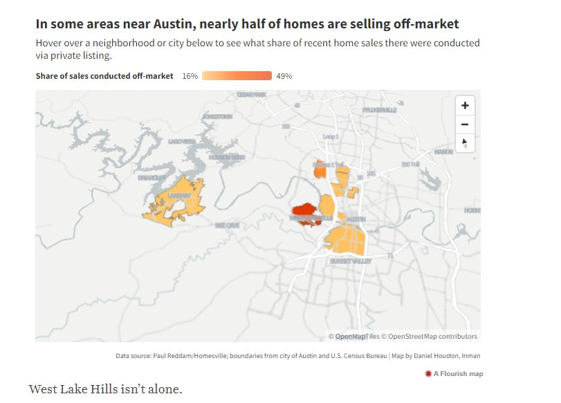
Layer that on the fact that the housing and real estate industries probably lag just about every other industry for technological advancements. There are a lot of reasons for that technological Dark Age in housing which I will get into in a later post and discuss briefly here, but some of the reasons we don’t fully understand inventory for sale- like pocket listings - are absolutely purposeful as those selling houses are always looking for an edge. I reached out to Realtor.com who did tell me that they are connected to 99.6% of the over 600 independent listing services (MLS) that exist today. What they refused to answer or tell me is the % of listings that don’t get “syndicated” or published to them. I asked them expressly if they tracked it and knew the percentage. When they didn’t answer specifically, I re-clarified my question and got no answer. There are a lot of reasons why someone would not want to syndicate a listing to publish to a national listing site like Realtor.com and I will elaborate more in future posts as I have a special treat for you today and don’t want to get sidetracked completely. But there is a solid case for this site - and by extension the Fed - missing anywhere from 25-50% of activity in any given market.
Notice anything else about the data series above? It goes back to 2017 only - not very helpful for historical comparisons.
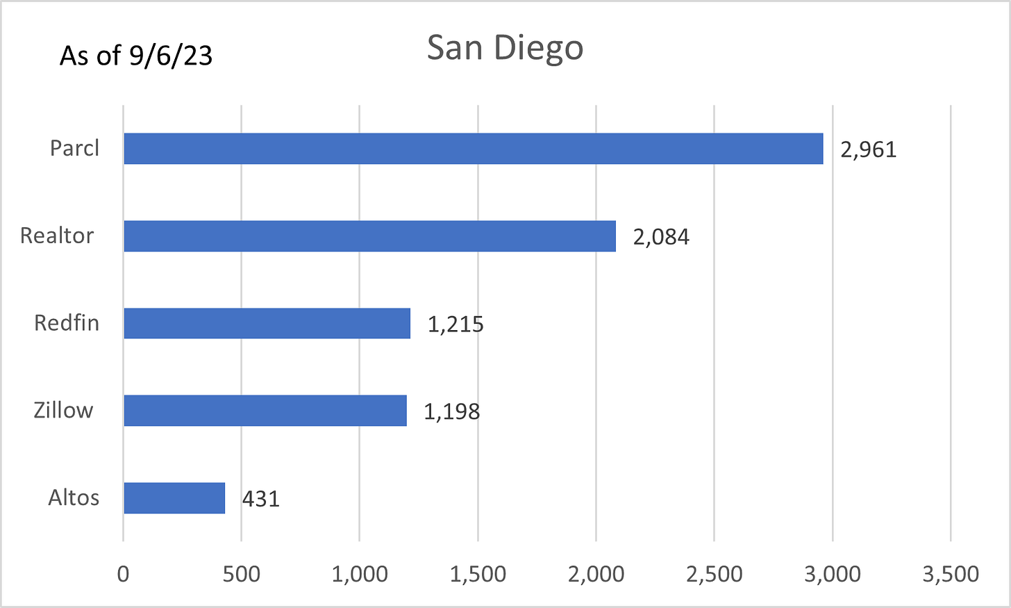
My main issue with this particular analyst from the debate is that they often throw out charts with zero discussion of what they are actually meant to represent, or say things like we look at forward-looking data without elaborating. And, in fairness, when you are constructing a post you don’t have a lot of room to elaborate. But, I think it is very important that we always try our best to acknowledge what we are trying to represent. In this case, the analyst works for a publication that acquired a data provider. That data provider makes claims about having access to “all” home listings and sales. And, that is simply not true, not even remotely. In fact when compared to other data providers, that particular one has the fewest number of listings, and they don’t really tell you how they are sourced. To spark the debate, I threw out my own controversial chart and of course a few Twitterers said it was misleading. Although I wouldn’t say it was misleading, I would agree that if I threw it out there claiming it was “absolutely” true and a valid comparison, then I would be no better than my opponent. My point of posting it is that I want people to ask the questions. I still don’t understand all the answers and differences myself, but I’m digging and digging until I do.
Relying on any one data source to understand what is actually happening is problematic no matter where it originates, its methodology or intended purpose. We have to question the data. And, that was the only point I really, really wanted to get across in the debate that was not a debate.
But, there are a thousand more points to make and not enough time. This week, friend of the show, Mr. Awsumb, has graciously agreed to share a recent analysis he did on permits and new-build inventory. And, I am so thankful as this is and will be a huge part of the story.
Before I hand you over, I do want to say thank you to all of you who offered education, support, shoutouts, charts, data, funny memes and good words before my debate debut last week. I wouldn’t have been able to do it without you. Having you behind me fuels me to carry on in the valleys of the shadows of social media and on the lonely backroads.
But, now, let’s get down and dirty, definition-#1 style (combined with a little definition-#6).
Got Inventory?
-Guest contributor, Mr. Awsumb
Hello,
I’m a longtime listener, first time caller. Thank you for having me on the show Melody. A bit about me, I’m a consultant in the real estate and construction industry. I’ve developed property, managed property and built a lot of buildings over the last 20+ years. I’ve even built for one of the largest publicly traded homebuilders in the US. Suffice it to say, I do have some experience.
What I really want to do today is shed some light on the current state of inventory of housing in the US, because as Melody has stated, there’s a lot out there. We’re going to do a deep dive into the Census Bureau’s New Residential series of data.
Here’s a chart from the US census bureau’s latest housing release showing 437,000 homes new homes for sale.
What does it all mean? Well, it depends on what the definition of the word is, is. Now don’t take me for the man who said that originally, but let’s genuinely evaluate the particulars. Because this is all a word game. If you ask the census bureau, we have starts, for sale and completions. If you read a homebuilder’s quarterly report, we have deliveries, orders and backlog. All words. And all have meanings.
Let’s start with the easy and straightforward clarifications. Believe it or not, that’s on the Government side. And you’ll understand why momentarily. The Census Bureau tracks permits as they’re approved. Meaning if a developer requests a permit and it’s approved, that’s a permit. When they actually begin construction, that’s a start. They’re actually reaching out to permitting offices to make sure the construction has started, and inspections are being completed. There’s your “starts”. Work has actually commenced. The difference between sitting on a permit and acting on it.
To date, as you’ll see, we have 437,000 Authorized Permits that are “for sale” out there. That’s all stages of permitting, from moving dirt to final touches and being built for sale. Which, out of the 793,271 permits pulled through July, that’s 55% of the permitted construction being built for sale. The rest are being built “for rent”.
Here’s a map of those 793,271 Permitted Units, where they’re located.
They go a step further though and call up the developer, to see if the permit is for a “for sale” or “for rent” property.
Now, the bureau tracks and monitors completions. From their definitions page:
“A house is defined as completed when all finished flooring has been installed (or carpeting if used in place of finished flooring). If the building is occupied before all construction is finished, it is classified as completed at the time of occupancy. In privately-owned buildings with two or more housing units, all of the units in the buildings are counted as completed when 50 percent or more of the units are occupied or available for occupancy. Housing completions are estimated for all areas of the United States, regardless of whether permits are required.”
They also track sales. But here’s where we’re reminded that government work is only “good enough”. A sale counts as a contract having been entered into or deposit money exchanged. If you’re anything like me, you live by the old adage, celebrate when the money clears and the deal is done. Not when it’s announced it’s happening. See here for the acknowledgement they don’t track cancellations.
This is important. Especially when we start taking into consideration cancelation rates. We’re going to use this chart from John Burns Real Estate Consulting to match those (Thank you Private Sector):
In order to match them, let’s take a look at the census data for starts, completions and sales:
Notice how starts and completions are always higher than sold? That’s because it takes into account all starts and completions. Let’s adjust so that we’re comparing “For Sale” only. That 437,000 units “for sale” represents 55% of the construction. Using that, we’ll apportion 55% of all deliveries to the for-sale market. It looks like this:
Once again, we see in all but Q1 of 2022, deliveries (completions) outpace sales, even unadjusted for cancellations. If I’m not mistaken, something happened after that quarter, that might have altered the market. I digress.
We need to adjust those sales, to get closings, and compare it to the monthly completions. We can use each month’s weighted average cancellation rate to discount the total sales, to get closings. Because those are what matter. For the months of March through July of 2023, I generously dropped the cancellation rate to 7%, which is still well below historical norms. But with that piece missing from the John Burns Data, I thought I’d be generous and understate potential inventory rather than overstate it.
Again completions well outpace sales. What that means, is that every month completions get piled onto existing inventories, and ends up looking like this:
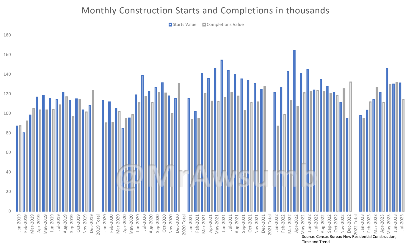
There’s an average of 120,000 starts every month through July, and an average of 117,000 units being completed every month. Contrast with the same survey data showing an average of 59,000 sales per month. Here are two charts showing; 1. Starts and Completions and 2. Sales Totals and by region.
Now let’s put it all together and see what it looks like when completions outpace closings, and what it does to inventory levels:
Melody has indeed seen a lot of empty inventory out there. And we have all the data to verify that. I’d like to add a caveat here though.
Caveat Emptor: THERE ARE ALWAYS MORE PRODUCTS IN THE PIPELINE THAN ARE SOLD
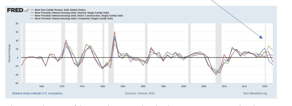
Homebuilding, like anything, is a product of production. No product, no sales. No sales, no business. No business, no money. However, Q1 22 was a historically challenging time for building, and demand was insatiable. Of course, interest rates were also at all-time lows. The level of inventory to sales has not been this skewed in quite some time. And don’t just take my word for it, here’s all the same data, from the St. Louis Federal Reserve:
A note: notice the historical separation between sales, starts, under construction and completions.
What I see in these rates of change on the FRED graph, is that there was never a reason to launch into production the way builders did, and because of it, there’s now a glut of inventory and we will be delivering 100,000 + completions per month through year end. To touch on a recent housing debate, this is forward looking data.
But that should be a familiar story by now. Producers of everything went full throttle through the pandemic to produce enough to meet demand spike. If you’ve read any of my other writings, you’ll know I’ve discussed at length the importance of rates of change, and what the rate of change of Government subsidy does to markets. Pandemic subsidy and “stimmies” poured gasoline on the fire, rather than carefully tending the coals to ensure a continued “cycle”. This story isn’t unrelated.
As to where might all these housing units be? Well, they’re everywhere. And one thing that’s certain, it’s that not all markets are created equal, there are winners and losers, there are States that have gained and lost populations, especially over the last 3 years. But if we were to allot them in equal distribution to how permits have been allotted, it might look something like this:
That’s just “built for sale”. Now onto Multifamily and For Rent. Here’s the completions per month of For Rent builds.
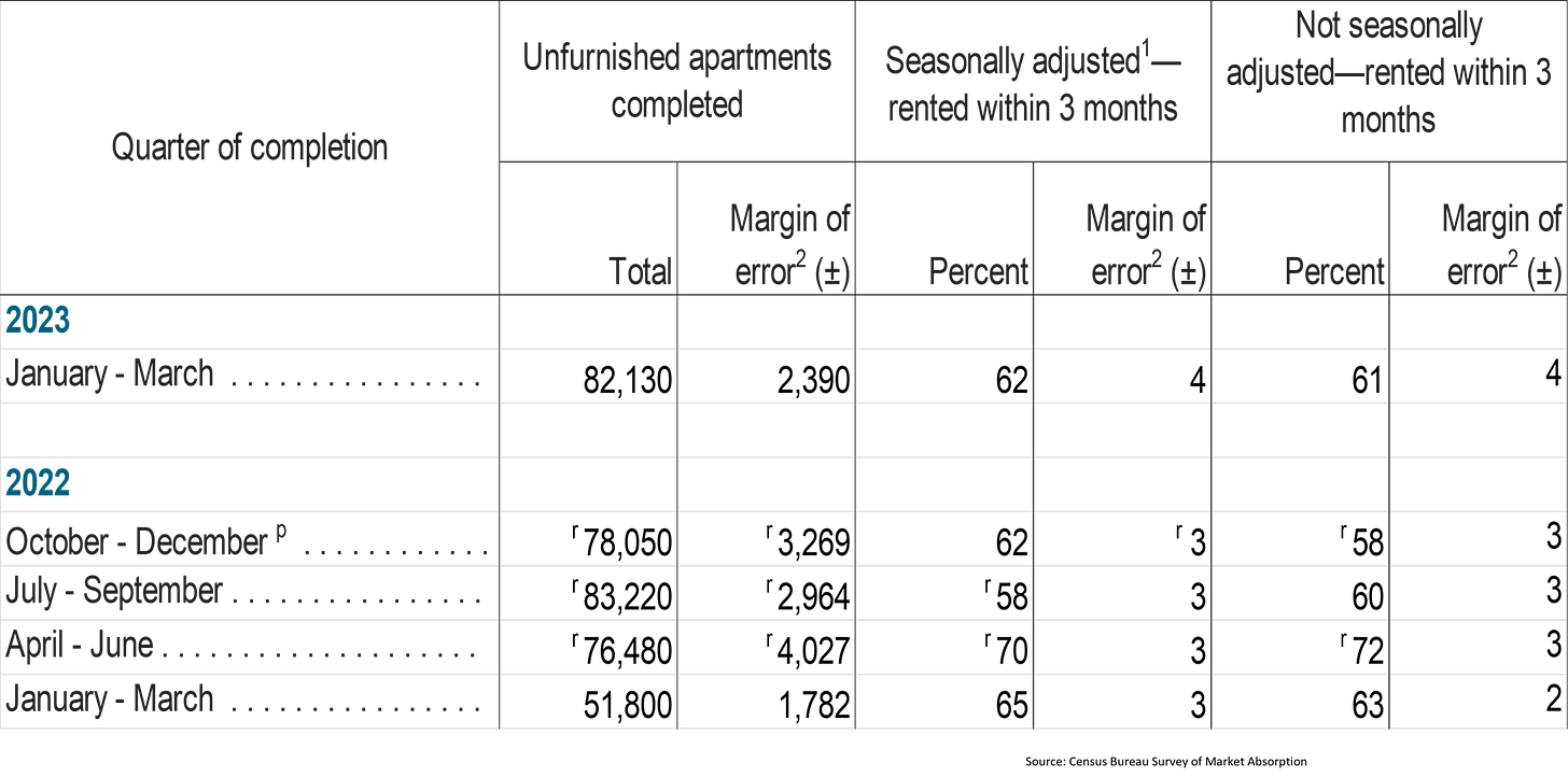
According to the US Census Bureaus SOMA (survey on market absorption) here are the completions and absorption rates for MultiFamily (apartments):
Now let’s compare the same data against the Construction completions data:
I think we just watched that movie. In fact, it looks the same in this format too:
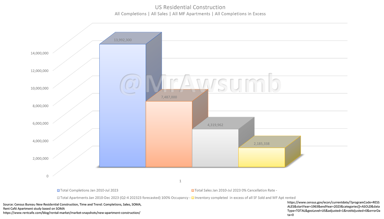
Once again, inventory stacked up rapidly, with more deliveries scheduled throughout the year. My only real question, is what are the other 627,000 completions that aren’t counted as apartments or built for sale since Q1 2022, and have they been rented? I bet Melody has shared photos of these:
Thank you, Mr. Awsumb! I cannot, cannot thank you enough. And thank you again to all of you who support me each week.
Listing stats will be in an extra post this week (likely tomorrow) along with the Wealthion interview that just aired.











How do we reconcile this picture of growing unsold new home inventory with this stat that shows months of inventory coming down?
https://fred.stlouisfed.org/series/MSACSR
Reminds me of when Zoltan Pozsar said the Fed intended to take down inflation by crashing markets to take away the money of the top 20%. He said the Fed had to get rid of the wealth effect.