
Roots

Well, folks, just when you think things can’t get any stranger, they do just that. I want to believe the best about people and heck, even institutions. I would have been a productive and faithful corporate slave forever had they not made my life an absolute living hell, completely untenable. My last true corporate job landed me in the ICU for eleven days in 2017 after internalizing the gulag mentality that governed that leadership team. I knew then I had to escape or else it was over for me. I could no longer stomach the BS, lies and hypocrisy…it was literally killing me.
So what bee is in my bonnet today? As I mentioned last week, Redfin did some massive changes to the free data they provide. I had to go back to the drawing board on an automated process I built some time ago. Redfin now provides a lot less granularity and has made things incredibly difficult to pull. Why would they make something so hard that previously worked seamlessly? Stupidity? Their new parent not down with being that transparent? Once I figured out how to pull and calculate most of the data I previously pulled, I was feeling pretty proud of myself for cracking the nut. Then, I turned to my national tables and noticed something very, very odd. The median sales prices and number of homes sold going back to 2012 were way lower than what was published previously. Some of you may recall that I had made a prior attempt to understand why their sales numbers were always higher than what the National Association of Realtors (NAR) and the Census combined reported? If they were pulling those additional sales from public record that would help me prove my private note theory. If you are new here, I believe NAR is missing some transactions due to the rise of private listings, social media and the private note market. The statement on Redfin’s methodology had changed on their website and was more vague than what had been stated in the past, so I couldn’t be sure. I received no response.
This time around I decided to take the social media route. Yesterday, I posted a reply to their original post about the changes to the data center. I assumed that I was missing something. I always first assume I’m missing something. My second assumption was that maybe they didn’t realize they were pointing to the wrong table in their backend database. I had a feeling they would respond by saying “send an email to the help center,” but I got no response. I finally did some posts about it that got quite a few views but still no response from Redfin even though the bot or offshore agent responded to other folks who posted questions.
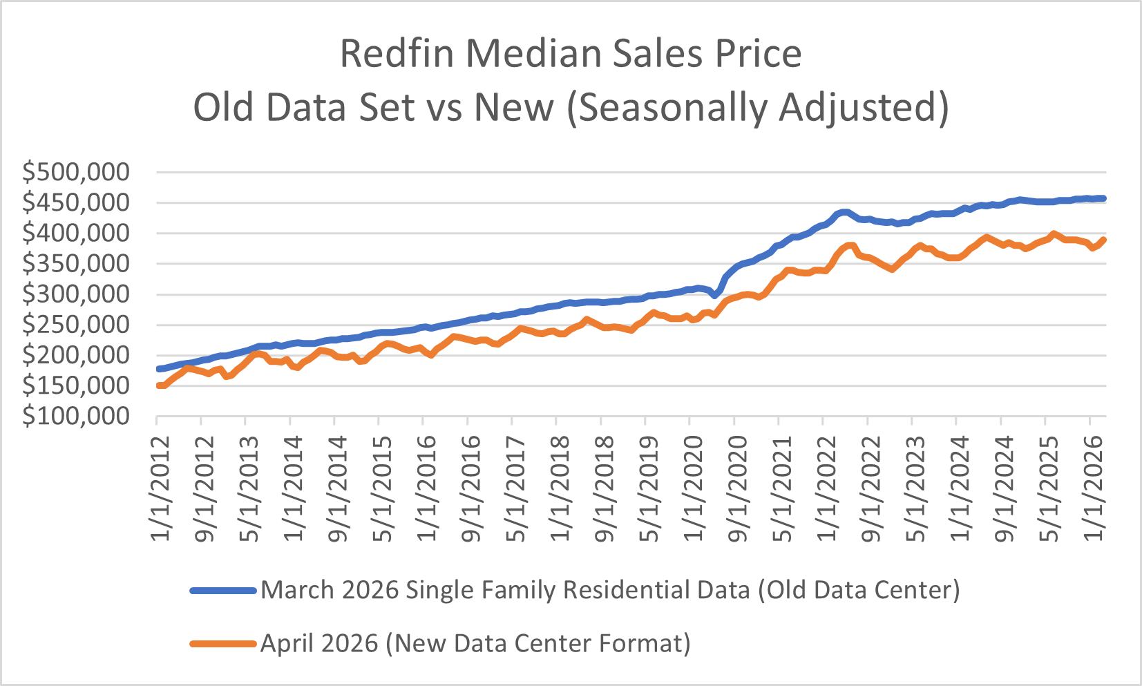
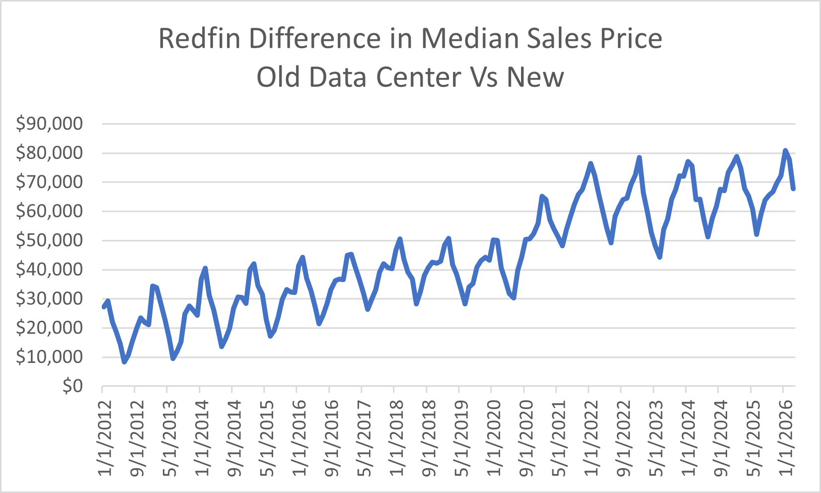
If I compare the old, seasonally adjusted single-family residential median sales prices to the new ones, the average difference is $44,307. In other words, on average the sales prices are $44,307 lower than previously reported going back to 2012.
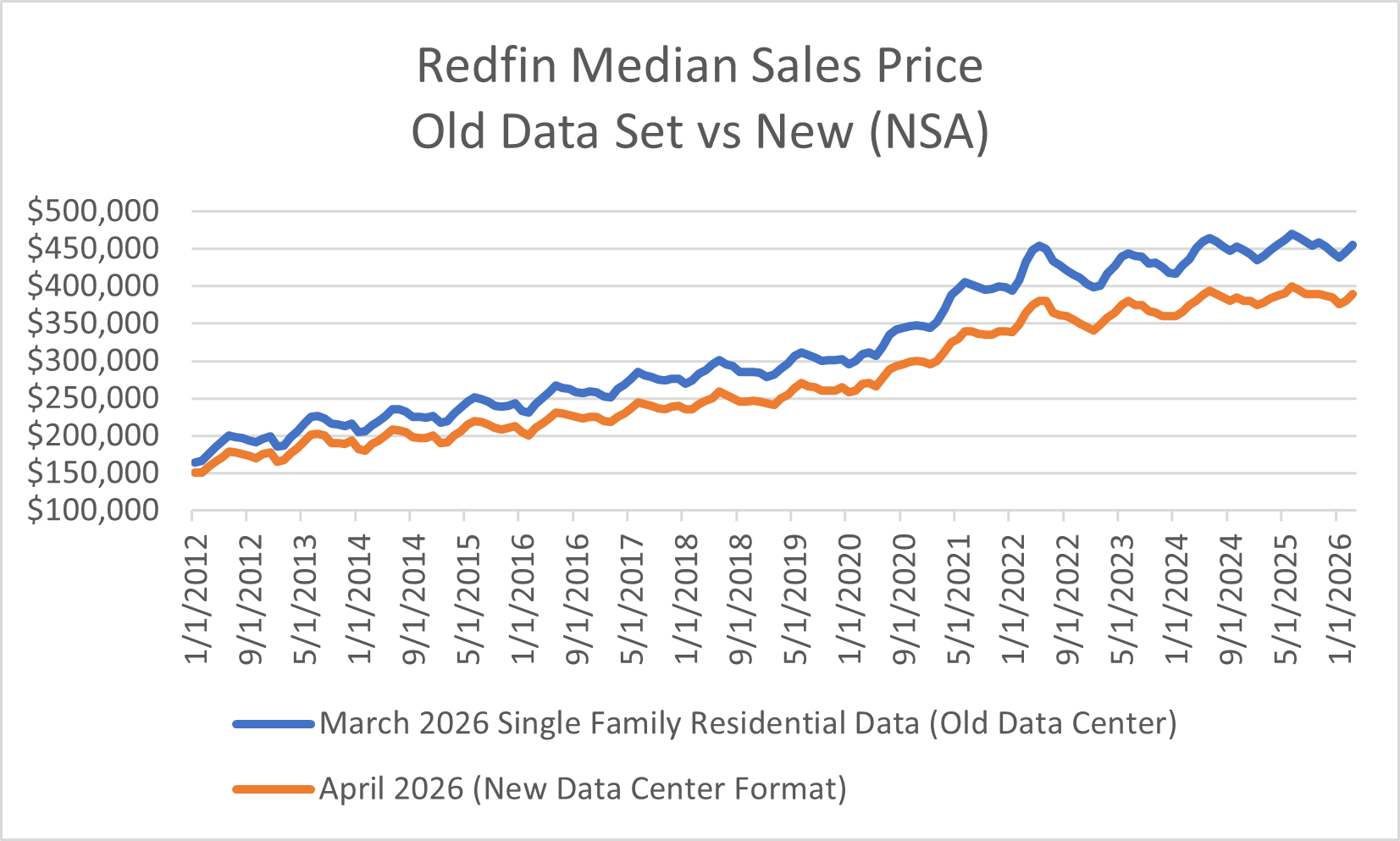
If I compare the old single-family residential non-seasonally adjusted to the new dataset the average difference is $44,178.
In the old data series, Redfin provided the breakouts for single-family, condos, townhomes, multi-family (2-4), etc. In the new data series, there is no breakout. So, I also compared the old “all residential” to be sure I wasn’t mixing apples and oranges. That average difference was only $33K.
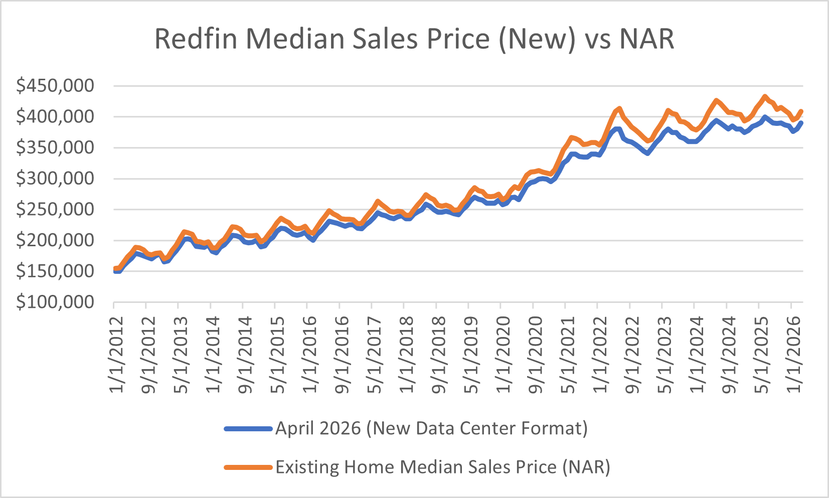
My next thought was that perhaps they removed any new home sales? That was why I had accepted that Redfin prices were always much higher than what NAR reported for existing home sales. When looking at an average though of new and existing median sales price numbers Redfin came in around $12K below that average. If you can’t tell by now, I have studied these numbers extensively doing side-by-side comparisons and calculations to try and understand trends and patterns. I have discovered things in the Redfin numbers I haven’t shared that pointed to some modeling off other series like Case Shiller, NAR and Census. Because I could not prove it absolutely, I filed it away.
What I would love is a discussion with their team to understand these new numbers. My best guess is that they did some sort of normalizing exercise where these prices are modeled using new and existing home median sales prices or Case Shiller. The problem is I have no idea, and now 14 years of history have changed which is so reminiscent of when NAR had to restate its numbers in 2011 after getting called out by CoreLogic. It’s also eerily similar to when the Census radically revised five years of history wiping off $36,800 from the previous new home median sales price peak recorded in October 2022. Some of you may remember when I found Realtor quietly restating the median list price they provide to FRED with no note or explanation. Had they not, median list price would have gone YoY negative last June. Anyhoo, for Redfin median sales prices to now be below what NAR is reporting - well that is indeed a change.
Old Data
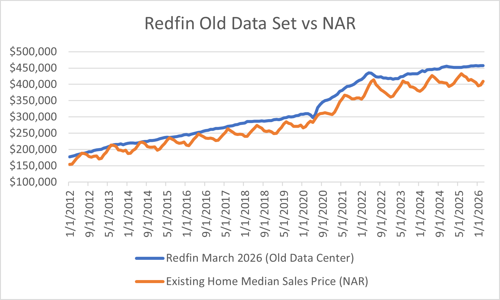
Could I still be missing something? Absolutely! I just want an answer. I’m sure their clients got some sort of explanation but not so for us data nerds in the wild. Also, I wonder how many people actually noticed because many analysts only look at % changes versus whole numbers? Who knows, but here we are. The end result is that the single-family median sales price Redfin provided in their March data set was $457,756. That median sales price is now $390,000 per the new data set. By the by, that new Redfin March number is very close to the new home median sales price for March which got slightly revised up to $391,100. Loud sigh. If I do hear from Redfin, you will be the first to know.
Moving on as one has to these days from yet another unpleasant realization, new home sales went right back into the dumpster after showing some strength in March, down -10.77% YoY and -7.94% MoM. In fact, April sales were -10.52% below the April average going back to 1999. Why pray tell? Based on their April median sales price of $422,500, they did not do enough price cuts to move the needle. This seems to be the builder pattern: a strong month using incentives and price cuts and then an abysmal month where prices go higher. The pattern is now very clear in all the data that lower sales mean higher prices.
Below, I will discuss those new home sales in detail as well as provide an update on delinquency. ICE begrudgingly confirmed what I saw in client books for April, and it ain’t good. As promised, we will also make a stop in Columbus, OH for a market deep dive. Many people miss the AI-adjacent speculation which has occurred in the Midwest that worked to continue to fuel sales price appreciation. By looking at regional results for M3 cities (detail provided below), sales in the Midwest have been the lowest of all the regions for the past three months. Inventory is growing there at the highest YoY rate (+7.33%) of the four regions, outpacing the Northeast (+5.92%) which is also approaching its housing market turn (watch out Boston!). New Albany and Columbus combined illustrate the marriage of real-estate speculation with datacenter mania. At the end of the day, the datacenter story is really about real estate as discussed last week. In my review of Columbus’ history I also discovered that a famous family has roots in Columbus which provides interesting context to the datacenter discussion. In addition to the regional results, I will share combined sales results for April. With the revisions, we are running -0.78% behind 2025 YTD for combined sales. Finally, you will also find one of my recent articles written for Unicus Research on the Freddie Mac multifamily securitization performance results which led to yet another very interesting data discrepancy discovery.
Let’s get going…
